Work Craft Archive Contact

2021–2025

Archive

Where the craft was built. Two earlier roles, 2021 to 2025, doing brand, campaign and experience work at a luxury hospitality group and a brand consultancy. It is here rather than on the front page because none of it can tell you whether it converted anyone.

This is not a chapter that closed. The art direction on the front page is this same craft, still running, pointed at a harder problem. The practice is 5.3 years and counting, not the four on this page.

2 earlier roles · the practice did not stop → see what I am doing now

Jun 2024 – Sep 2025

I Quadrant

Brand Experience Designer

May 2021 – Apr 2024

COMO Group

Graphic Designer

I Quadrant · Brand identity

A podcast brand, from nothing

I Quadrant was launching First Pot Of Gold, a podcast on financial literacy. It had a host, a video team and a strategist. It did not have a face.

Role
Brand identity
Worked with
Video team, strategist, host
Made
Logo directions, final mark, brand framework

Listening before drawing

I started with conversations, not sketches: the video team, the strategist and the host, to understand what the show was for and how it should feel. It was pitched as a sit-down sharing session, so the identity had to feel like a conversation, not a lecture about money.

Directions explored

Two families came out of it: a structured wordmark with a microphone standing in for the O, and looser, rounded lettering poured into a pot of gold.

Logo direction: rounded lettering inside the outline of a pot Logo direction: rounded lettering in green and gold inside a pot outline Logo direction: rounded white lettering with a pot handle above Logo direction: stacked wordmark with a microphone as the O, coins above the pot Logo direction: stacked wordmark with a microphone as the O, inside a green pot The final mark: rounded lettering in a pot with gold coins on top, as a sticker

Five directions explored · the final mark, bottom right

The mark that stuck

The final kept the rounded lettering and the pot, and added the coins. It reads at thumbnail size, holds up as a sticker, and survives being dropped onto a busy video frame, which is where a podcast logo spends most of its life.

I Quadrant · UX & web

A homepage redesigned on evidence

The old mobile homepage opened by describing the company. My redesign opened by talking to the person holding the phone. It never went live, but the reasoning is the part worth keeping.

Role
User research, UX, UI
Research
Stakeholder interviews, workshops, surveys
Status
Proposed redesign, v1.0 → v2.0, not launched

What the redesign changed on the first screen, and why

Version 1: a generic header reading Meaningful Real Estate Knowledge above an event photo
v1.0
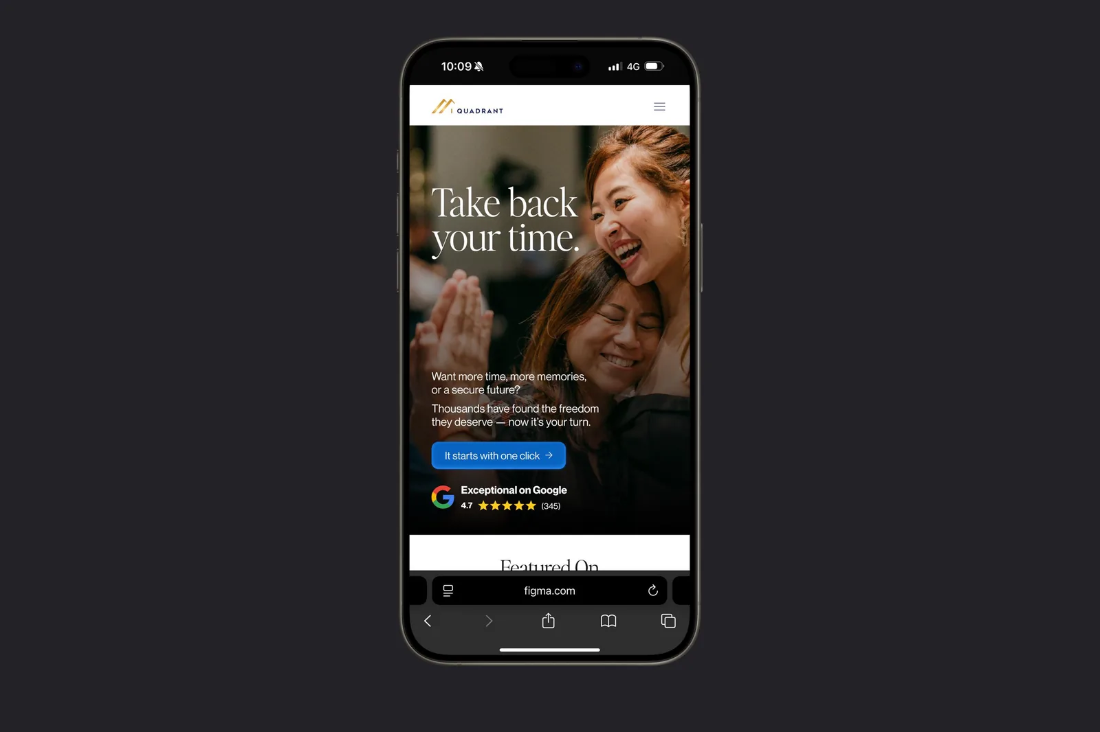
Version 2: the header Take back your time, visitor-focused copy, a call to action and a Google rating
v2.0
  1. A header with a pulse“Meaningful Real Estate Knowledge” describes the company. “Take back your time.” describes what the visitor wants.
  2. No more tapping on nothingv1.0 had a standalone photo that wasn’t interactive, which can confuse people into dead clicks. v2.0 folds the imagery into the header.
  3. Copy about them“Want more time, more memories, or a secure future?” puts the visitor in the sentence.
  4. A reason to tapA curiosity-led call to action: “It starts with one click.”
  5. Proof, up frontThe Google rating moves onto the first screen, before anyone has to scroll for trust.

The same thinking, on landing pages

At I Quadrant I also designed landing pages across funnel flows and travel booking. Every layout, button and scroll was designed with the conversion in mind, not just the look.

Landing page for a UK learning trip, shown on a desktop screen Landing page for a seven-night trip, shown on a desktop screen Landing page for an investor experience, shown on a desktop screen Landing page titled How I Retired My Parents, shown on a desktop screen

I Quadrant · Event & experience

An event you walk through

Market Leader Summit is a one-day live event for property investors. It runs twice a year, with a new theme each time. For one edition I had two months to get from concept to a room of 600 people.

Role
Design concepts, merchandise, landing pages
Worked with
Art Director, on the key visual
Scale
600 participants
Timeline
60 days, concept to crowd

The idea

The theme was Investors of Impact: stepping up and making a meaningful impact for yourself and the people you love. The artwork follows a track through life’s ups and downs, while the shapes beside it settle into a square, for guidance and stability, and the four foundations the brand talks about: physical, emotional, mental and spiritual. Freedom, with some structure.

Ideation artwork: a dotted track winding past abstract shapes in yellow, green, blue and white Key visual: Investors of Impact, with the letters of IMPACT built from geometric shapes

Ideation · the key visual, developed with the Art Director

So the theme didn’t stop at the stage

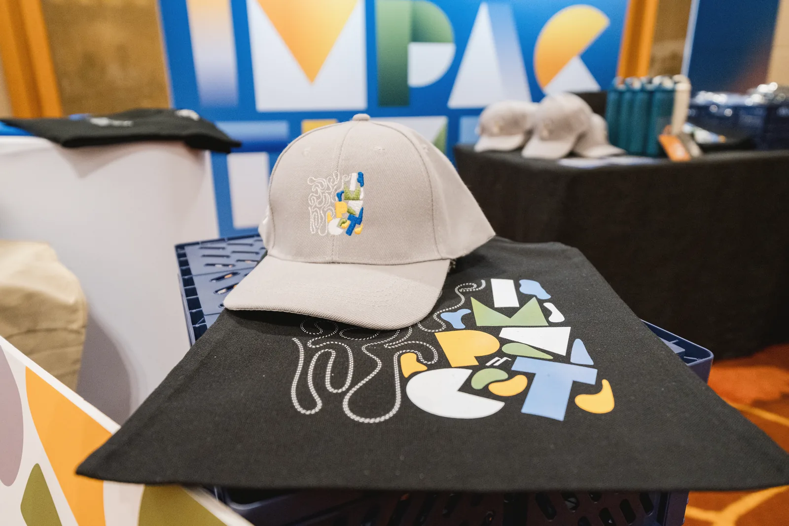
From there I turned the identity into apparel and merchandise: totes, caps, bottles, card holders and tees, so the theme carried beyond the stage.

The summit merchandise booth, with the IMPACT backdrop and apparel on display A black tote bag printed with the IMPACT artwork, beside branded bottles An embroidered cap and card holders with the IMPACT artwork Blue and black t-shirts printed with Investors of Impact

The landing pages

I also designed the responsive landing pages. Each edition gets its own theme, which is why this page looks nothing like the merchandise, and why designing for a brand that keeps evolving is its own challenge.

What I hold a landing page to: a headline that hooks, brief copy about the benefit, visuals that earn the attention, something to trust, and one clear call to action. A sales pitch with nothing in the way.

Three phones showing sections of the summit landing page in black and lime The top of the summit landing page on a phone, with the date, ticket price and a Secure your seat button

Landing page for a later edition, 15 Nov 2025

COMO Group · Campaigns

Campaigns across a luxury group

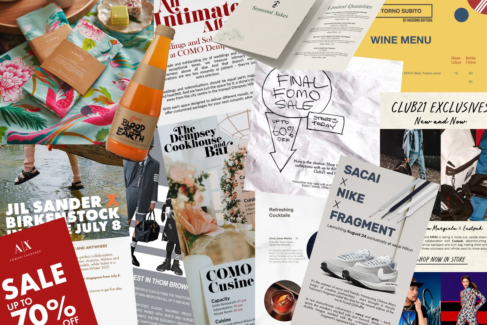
Three years across COMO’s food, retail and hospitality brands meant switching registers constantly: a dark, moody Christmas for one brand, a bright orange one for another, and a sneaker drop in between. Here are four.

Role
Graphic designer
Brands
Culina, SuperNature, Club21
Formats
Catalogues, packaging, web banners, email

Culina · Christmas catalogue

I went dark that year to push the contrast in the food photography, so every dish read with more detail and focus. Layouts change from section to section to separate the categories, while the brand’s colours hold it all together. The point was the product, not the page.

Culina Christmas catalogue covers, The Holiday Reunion A dark catalogue spread titled Splendours of the Season A catalogue spread titled Setting the Christmas Table

SuperNature · Christmas catalogue

The opposite brief. The brand’s own orange on the cover to grab attention, then a simple rhythm inside: the picture on one page, the description on the other, so each product is easy to take in.

SuperNature catalogue with an orange cover reading Eat Drink and Be Merry An open SuperNature catalogue: food photography on one page, descriptions on the other

Culina · Chinese New Year

Packaging and decorations, developed with my Lead Designer. We built layouts for each version and took them to the team for review before settling on the final design.

Bunting reading Gong Xi Fa Cai from Culina
Red Culina snack tins with a white tiger illustration A round red label for Kueh Rose with a white tiger illustration

Packaging shown as mock-ups

Converse × PLAY Comme des Garçons

The photography was supplied. My job was the rest: typography, layout and image work for the web banner and the launch email, inside the brand’s guidelines.

Web banner: Converse x PLAY Comme des Garcons Chuck 70, in new colourways for you Launch email for the Converse x PLAY Comme des Garcons Chuck 70

Web banner · launch email